The cryptocurrency markets, similar to any other type of markets, allows traders and investors to trade cryptocurrency through various brokers. These broker platforms more often than not include some kind of trading chart.
Using these charts, investors and traders attempt to gauge which way the markets will move. Specifically, whether or not the price of crypto will rise or fall in the near to medium future. Based on their analyses, they then adjust their crypto portfolios to either reduce the risk of their portfolio losing value or attempt to grow the collective value of their portfolios.
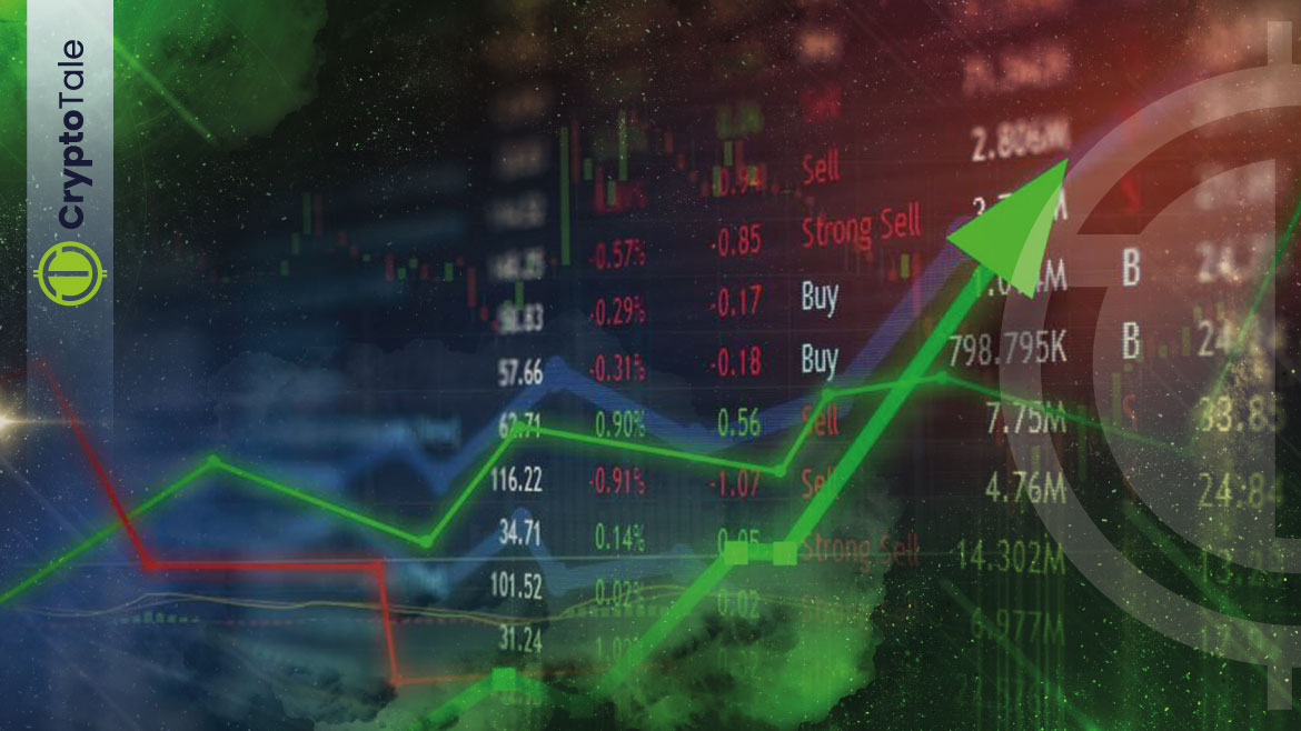
For any newcomer, reading the charts can be a daunting task at first. This article will take a look at some of the basics that you need to know if you want to interpret crypto trading charts and potentially make a few gains from doing so.
What is Fundamental Analysis?
Fundamental Analysis (FA) is a method of measuring the intrinsic value of a security, such as a cryptocurrency, by examining related economic and financial factors.
Fundamental analysts monitor any events that can affect a security’s value, which can include macroeconomic factors such as the state of the economy and industry conditions, or microeconomic factors like the effectiveness of a company’s management.
The end goal of fundamental analysis is to arrive at a number that an investor can then compare with a security’s current price in order to see if the security is under or overvalued.
Fundamental analysis is regarded as a contrast to technical analysis.
What is Technical Analysis?
Technical analysis is the trading discipline employed by traders and investors to evaluate investments as well as identify trading opportunities by analyzing statistical trends gathered from trading activity, such as volume or price movement.
Unlike fundamental analysis, which attempts to gauge the intrinsic value of security relating to a business, technical analysis is more focused on the study of price and volume.
Technical analysis tools are used to scrutinize the effect of supply and demand on a security’s price, volume, and volatility, and operate on the premise that historic trading activity and price changes of security can be valuable indicators of the security’s future price movements.
It is often used to generate short-term trading signals from a variety of charting tools, but can also help improve the valuation of a security’s strength or weakness when compared to the broader market or one of its sectors. Analysts can utilize this information to improve their overall valuation estimate.
Technical analysis and trading charts normally go hand in hand, as technical analysis is applied to the information presented in the trading chart.
What is a Trading Chart?
A trading chart is a sequence of prices drawn over a certain time frame. On trading charts, the vertical axis, the y-axis, signifies the price scale while the horizontal axis, the x-axis, represents the time scale.
Reading Trading Charts
In technical analysis, transitions between rising and falling trends are often signaled by price patterns. Simply put, a price pattern is a recognizable configuration of price movement that is identified using a series of trendlines and curves.
When a price pattern occurs that signals a change in the price’s direction, it is known as a reversal pattern, whereas a continuation pattern happens when the price trend continues in its current direction following a brief pause.
Trendlines
Since price patterns are identified using a series of lines or curves, it is important to develop an understanding of trendlines and how to draw them. Using trendlines, analysts are able to identify spot areas of support and resistance on a price chart.
Simply put, trendlines are straight lines drawn on a chart by connecting a series of descending peaks, normally referred to as highs, or ascending troughs, also known as lows.
A trendline with a positive slope occurs when prices experience higher highs and higher lows. The upwards-sloped trendline is drawn by connecting the ascending lows. On the other hand, a trendline with a negative slope occurs when prices experience lower highs and lower lows.
Depending on the part of the price bar that is used to draw the line, the trendline may vary. Although there are several opinions as to which part of a trading chart candle should be used to draw a trendline, the body of the candle is often where the majority of the price action occurred. Therefore, it may be the best point to draw a trendline through when looking at the accuracy.
Continuation Patterns
A continuation pattern can be thought of as a brief pause during a prevailing trend. This can either be a time in which bulls catch their breath during an uptrend, or a time wherein bears relax for a moment in a downtrend.
During the formation of a price pattern, there is no clear indication as to whether or not the trend will continue or come to an end and reverse. With this in mind, close attention must be placed on the trendlines used to draw the price pattern.
In general, the longer the price pattern takes to develop, and the larger the price movement within the pattern, the more significant the move will be after the price breaks above or below the continuation area.
If a price continues its trend, it is known as a continuation pattern. Some of the most common continuation patterns are pennants, flags, and wedges.
Pennants
Pennants comprise two trendlines that eventually converge. One of the major characteristics of pennants is that the trendlines move in two directions. This means that one will be a negatively sloped trendline while the other will be sloped upwards.
Normally, there will be a decrease in volume during the early stages of a pennant formation, which is then followed by an increase when the price eventually breaks out.
Flags
Flags are constructed using two parallel trend lines that either slope upwards, downwards, or sideways. In general, a flag with a positive slope appears as a pause in a downwards trending market. A flag with a downwards bias is suggestive of a break during an up-trending market.
Volumes during the formation of a flag normally decline, but then the volume recovers as price breaks out of a flag formation.
Wedges
These are similar to pennants in that they are drawn using two converging trendlines. However, a key characteristic of a wedge is that both trendlines move in the same direction, being either up or down.
A wedge that is pointed downwards represents a pause during an uptrend, while a wedge sloped upwards shows a temporary detour during declining market conditions.
Similar to the previous two continuation patterns, volume typically tapers off during the formation of a wedge, only to increase once the price is able to break above or below the wedge pattern.
Triangles
Triangles are one of the most popular chart patterns in technical analysis since they tend to occur more frequently compared to other chart patterns. The three main types of triangles are symmetrical triangles, ascending triangles, and descending triangles. Triangle chart patterns can play out for anywhere between a couple of weeks to several months.
Symmetrical triangles happen when two trend lines converge toward each other and signal only that a breakout is likely to occur, not the directions.
Ascending triangles are characterized by a flat upper trend line and a rising lower trend line. This suggests that the chances of a higher breakout are good. Meanwhile, descending triangles have a flat lower trend line and a falling upper trend line, which is suggestive of a likely breakdown.
The magnitude of the breakouts or breakdowns is typically the same as the height of the left vertical side of the triangle.
Reversal Patterns
A price pattern that signals a shift in the prevailing trend is referred to as a reversal pattern. These patterns are the beginning phases of periods where either bulls or bears have run out of steam or their momentum in the market has weakened. The established trend will pause and then head in a new direction.
Reversal patterns that take place at market tops are referred to as distribution patterns, where the trading instrument is sold more than it is bought. While reversals that occur at market bottoms are known as accumulation patterns and are when the instrument becomes more actively bought than sold.
Similar to continuation patterns, the longer the pattern takes to develop and the larger the price movement within the pattern, the larger the move will be once the price breaks out.
When a price reverses after a pause, the price pattern is what is known as a reversal pattern. Some common examples of reversal patterns are head and shoulders, double bottoms, and double tops.
Head and Shoulders
These patterns can appear at both market tops and market bottoms and are shown as a series of three pushes. These pushes are an initial peak, which is then followed by a larger peak, and then a third push that mimics the first.
An uptrend that is interrupted by head and shoulders patterns may result in a trend reversal, leading to a subsequent downtrend. On the other hand, a downtrend that results in a head and shoulders bottom will likely experience a trend reversal that will see the price rise.
The peaks and troughs that appear between the head and shoulders can be connected by drawing horizontal or slightly sloped trendlines. At the beginning of the pattern’s development, a volume may decline but then jump back once the price breaks either above or below the head and shoulders pattern.
Double Top
Double tops and bottoms signal areas where the market has unsuccessfully attempted to break through a support or resistance level. In a double top scenario, which often looks like a letter “M”, an initial push up to a resistance level is preceded by another failed attempt – creating a trend reversal.
A double bottom, being an inverted double top, looks like the letter “W”, and is when the price tries to push through a support level, is denied, and then makes a second unsuccessful attempt to breach the support level. This too results in a trend reversal.
Triple bottoms and tops are reversal patterns that don’t happen as often as head and shoulders or double tops and bottoms. However, they act in a similar way and are a powerful trading signal for a trend reversal. These patterns are formed when a price tests the same support or resistance level three times and is not able to break through.
Gaps
This pattern occurs when there is an empty space between two trading periods. This is normally caused by a significant increase or decrease in price.
The three main types of gaps are breakaway gaps, exhaustion gaps, and runaway gaps. Breakaway gaps form at the start of a trend, runaway gaps form during the middle of the trend, while exhaustion gaps tend to happen near the end of the trend.
The 4 Most Common Technical Indicators
Moving Averages
Moving averages are a technical analysis tool that smooths out price data by creating a constantly updated average price. When it comes to a price chart, the moving average creates a single, flat line that is able to eliminate any variations due to randomized and fluctuating price movements.
The average is taken over a specific time period and can either be 10 days, 20 minutes or 30 weeks. The trader can choose any time period that they desire. For investors that have a longer-term focus, the 200, 100, and 50-day simple moving averages (SMA) are popular choices.
There are a few ways to make use of moving averages. The first is to look at the respective angle of each moving average line. If it has been in a horizontal movement for a reasonable amount of time, then the price is said to be ranging, not trending.
If the moving average line is sloped positively, then an uptrend is underway. One thing to note is that moving averages can’t be used to make predictions about the future value of a cryptocurrency. These lines simply reveal what the price is doing at that moment of time.
The last way to utilize moving averages is crossovers. Crossovers normally implement the 50 and 200-day moving averages, and traders normally see a 50-day SMA cross above the 200 SMA as a buy signal. Conversely, when the 50 SMA crosses below the 200 SMA, traders treat it as a sell signal.
Moving Average Convergence Divergence (MACD)
The moving average convergence divergence (MACD) is what is known as an oscillating indicator, which is a technical analysis indicator that varies over time within a band. The MACD indicator is both a trend-following and a momentum indicator.
One of the basic MACD strategies is to look at which side of zero the MACD lines are on in the histogram that is normally present below the chart. The crypto is said to be trending upwards if the MACD lines are above zero for a sustained period of time. The opposite is true when the MACD lines are below zero for a sustained period of time.
Using this strategy, traders can look to potentially enter into buy trades when the MACD moves above zero and may look to enter into a sell trade if the lines cross below zero.
Another MACD strategy that can be implemented into a trading strategy is signal line crossovers. A MACD has two lines, where one line is a fast line and the other is a slow line. A buy signal occurs when the fast line crosses through and above the slow line. A sell signal is when the fast line crosses through and below the slow line.
Relative Strength Index (RSI)
The relative strength index (RSI) is also an oscillating indicator. However, the RSI’s movement is restricted within the range of 0 and 100.
With the RSI indicator, the price can either be “overbought”, “oversold”, or “neutral”. With the previous two scenarios, a correction is more than likely to follow. When the indicator is above 70, the price is overbought, and when the indicator is below 30, it is said to be oversold.
Normally, in a strong uptrend, the indicator will often reach 70 and beyond for sustained periods of time. On the other hand, downtrends will see the indicator break below 30 or below for a long period of time. Although general overbought and oversold levels can be accurate most of the time, they may not provide timely signals for trend traders.
On-Balance Volume (OBV)
The on-balance volume (OBV) takes a large quantity of volume information and compiles it into a single indicator. This indicator measures the cumulative buying and selling pressure by adding the volume on good days and subtracting volume on bad days.
Ideally, the volume should confirm trends. A rising price should be accompanied by a rising OBV, while a falling price should be accompanied by a falling OBV.
To Recap
There are two types of analyses that can be performed on the markets, and they are technical analysis and fundamental analysis. Fundamental analysis is when news events are used to try and gauge what a price will do, whereas technical analysis focuses more on price and volume trends.
There are two types of chart patterns. The two types of patterns are continuation patterns which signal that the prevailing trend will continue after a brief pause and reversal patterns which indicate that the price will exit the prevailing trend and enter into a new one.